


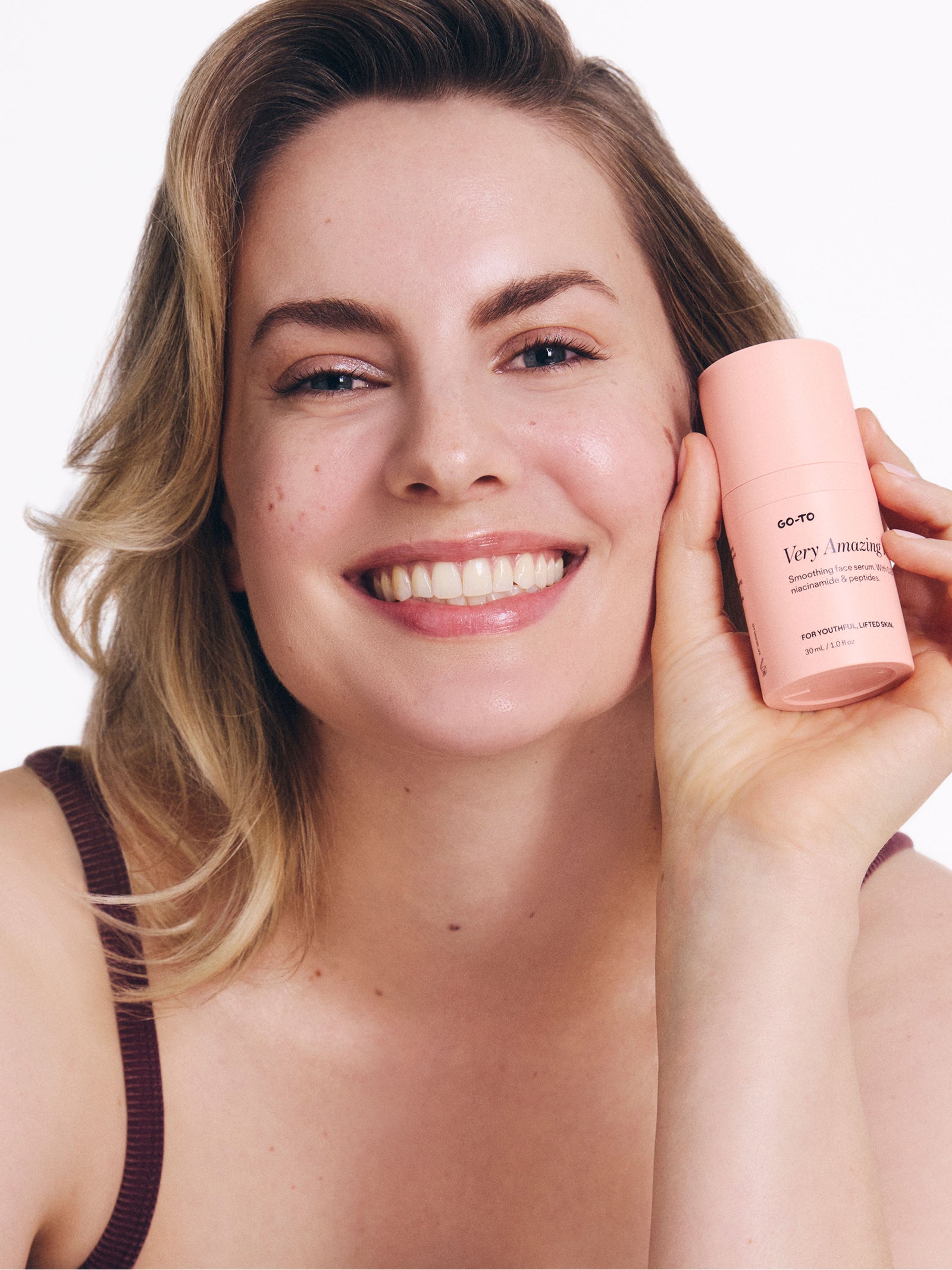


No, your eyes aren’t playing tricks. The packaging on our new deliciously glossy lip oil (Lip Hero) does look a little different. It’s actually got a tweaked font, a new colourway, and a fresh feel.
This little costume change is just the beginning. We're rolling out a full glow-up across the entire Go-To range: A carefully considered, multi-stage packaging redesign to make your skincare easier to navigate, use, and love.
In the case that you’re feeling confused, excited, weirdly sentimental about your favourite skincare’s OG packaging (same), our CMO Leonie is here to explain the ‘why’ behind this new era of Go-To.
What’s changing?
Leonie: Excitedly, our packaging. That’s it. Our formulas are completely untouched.
We’re making a few cosmetic changes to how our packaging looks, feels, and functions so our products can be as effective and uncomplicated as ever.
Why is the packaging changing?
Leonie: For several years, we’ve been hearing from some of our community about the poor legibility of our white font on peach packaging. And for many (including Zoë and I) trying to navigate Go-To when glasses-free in the shower can be a challenge.
Back in May 2024, we ran a market research study to better understand this. We asked over 50 women to navigate our products and report back. What we heard was humbling. But helpful.
Turns out, we were making things harder than they needed to be.
Our signature peach and white packaging, although very pretty, was a challenge to read under the bright lighting of retail shelves and your bathroom vanity. The font was just as hard. People mentioned they had to squint. Some even said they used the wrong product all together.
The range was also beginning to feel confusing as it got bigger. It wasn’t just tricky in store, people told us they couldn’t figure out what to use, or in what order, in their own bathroom.
And finally, our products were lacking clear cues for skin concerns. We weren’t giving enough visual hints to help customers choose products based on their specific needs.
Overall, the feedback was clear: Our packaging wasn't doing our formulas–or you—justice. And so, we’re changing it. Not to be trendy, but to be useful. Because that’s what you deserve.
Does this mean Go-To’s going all serious?
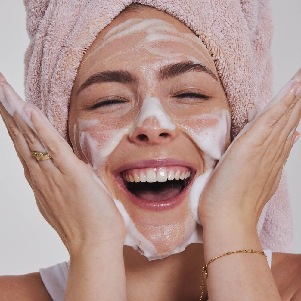
Leonie: Never. We’re still here to make things fun that have no right to be. And to us, fun is knowing wtf you're putting on your face.
The skincare world has seriously leveled up since we first launched in 2014. Drastically. People are now more informed than ever. More ingredient conscious, more skincare obsessed, and way more savvy thanks to the likes of TikTok, The Go-To Gang, MECCA Chit Chat etc. etc.
As a team of passionate skintellectuals, we love this change. We love that our customers are more engaged than ever with what they’re putting on their faces and want the facts, figures, and receipts (aka. clinical studies).
So it was time for our products to step up to meet our community where they are—confident, curious, and ready for more.
What will this redesign actually look like?
Leonie: We’re refreshing our packaging to make things easier. That means:
-
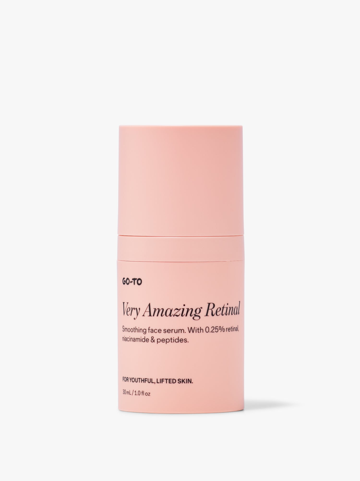
More clarity and legibility.
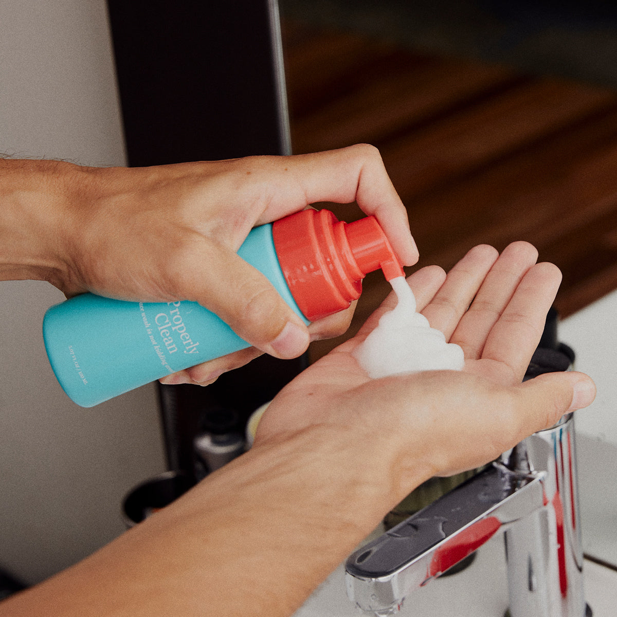
We’re ditching the white font and opting for a crisp black. We’re tweaking the typeface and on pack hierarchy of information. So you can quickly spot what each product is, what it does, and if it’s right for your skin. No more double takes. No more mix-ups. No more using body oil as a cleanser.
-
Better range navigation.
Expect clearer, clever-er design and naming cues. So you can confidently build and use your routine—whether you’re in MECCA or half-asleep in your bathroom at 5:54AM.
-
A little more science.
We’re putting the proven ingredients and efficacy behind our products front and centre. Because our community of fellow skincare loyalists can handle it—and cares about it. That means more transparency around actual ingredient percentages, more insight into our clinical studies, and more from our in-house lab.
-
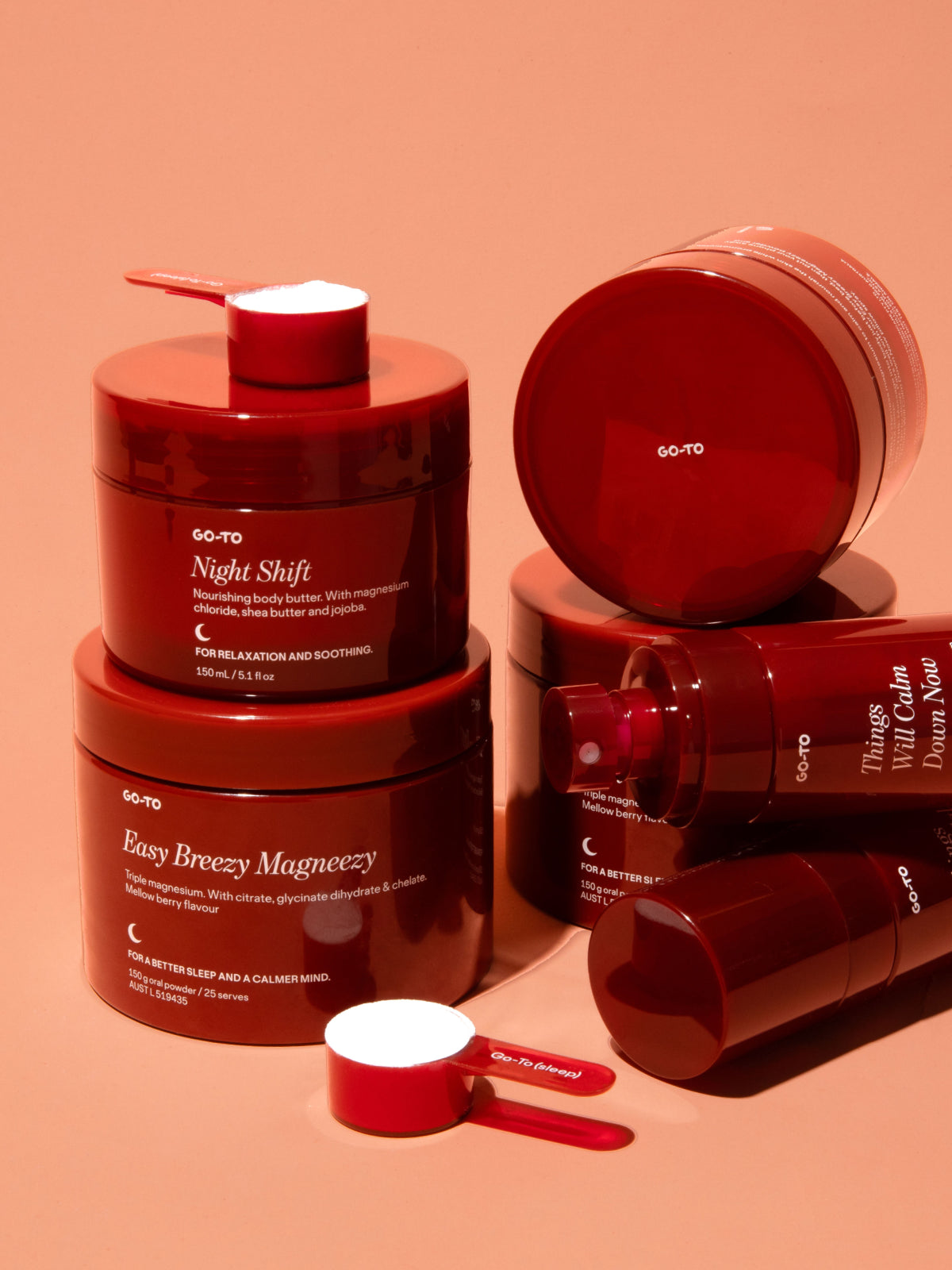
A tad more elegance
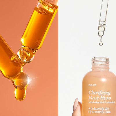
Because why not? We figured while we were at it, we’d zhuzh a few things up. Think: A new glass bottle for Oil Over. A new pump for Juicy Gel. And swanky matte packaging across the board.
When’s this happening?
Leonie: Definitely not overnight. We’re rolling out this change across several months. Nothing’s going to waste so you might receive an order with a bit of old and a bit of new. But we hope you can sit tight and bear with us.
We’re still your Go-To. Just a bit easier to read. And a little Fancier-er.
Wait, what’s Go-To's new seasonal colour analysis then?
Leonie: The lady said we’re still a Light Spring.
Got questions? Thoughts? Feelings? A heartfelt eulogy to our old packaging? We want to hear it all.

Comments